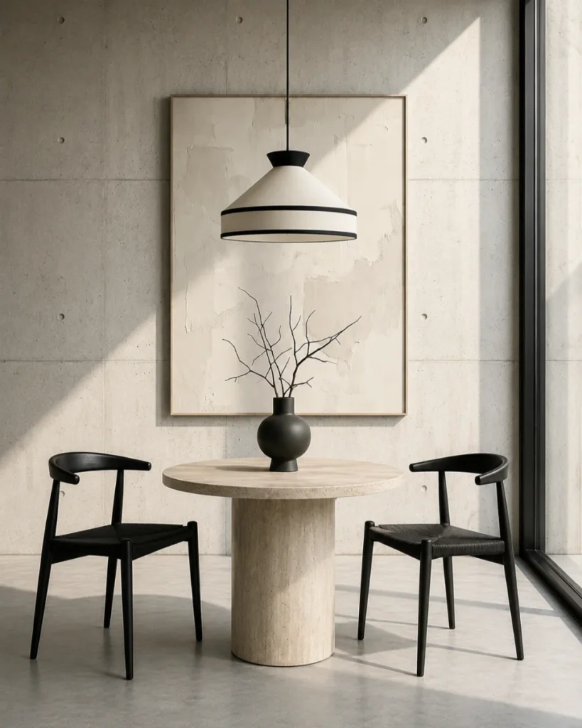
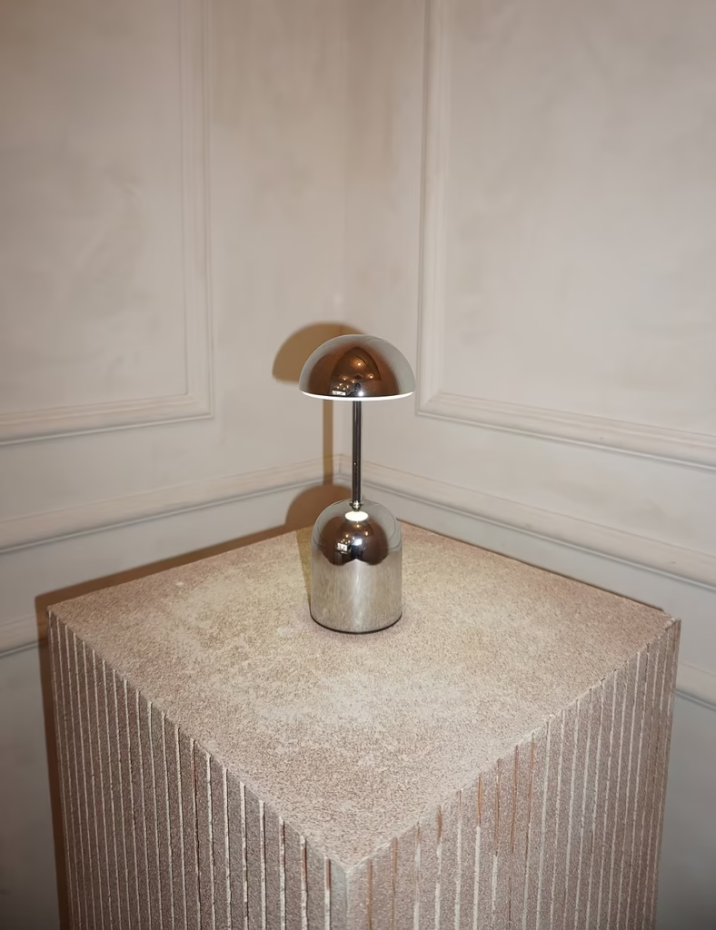
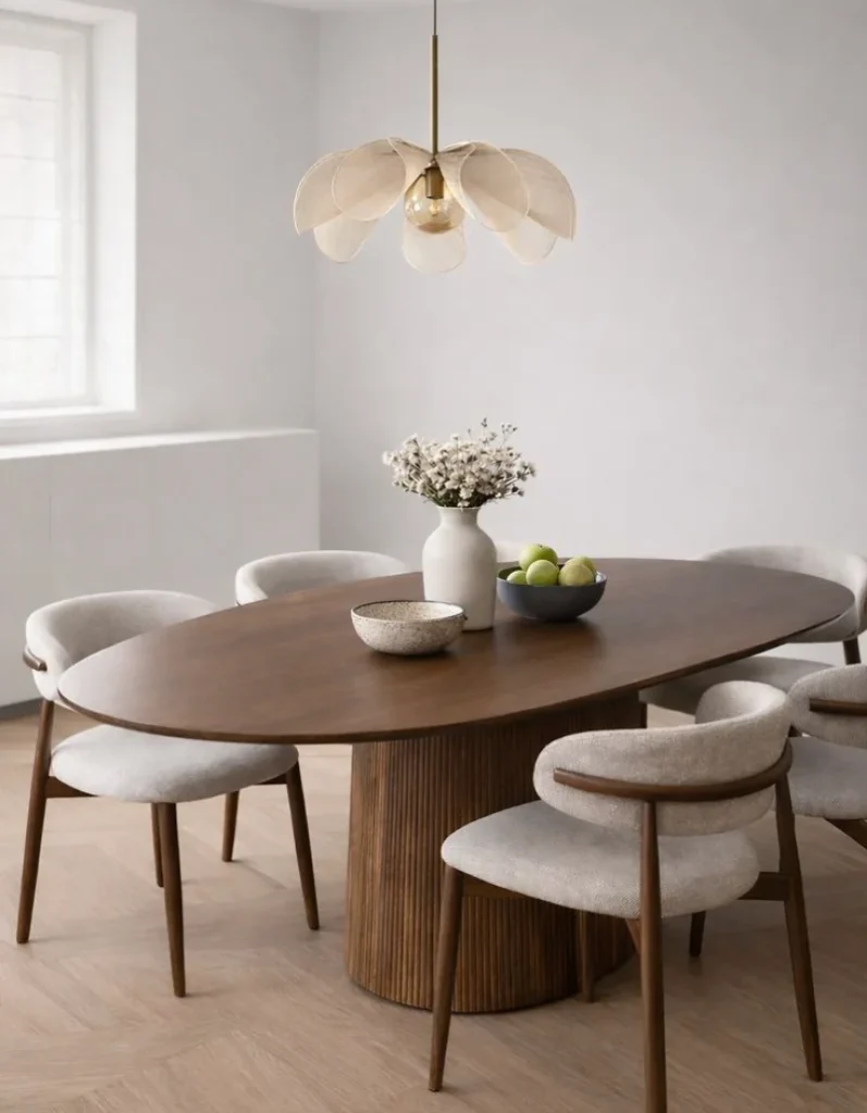
Every year, Pantone chooses a colour that seeks to reflect the spirit of the moment and influence areas such as design, fashion, and decor. For 2026, the choice falls on PANTONE 11-4201 Cloud Dancer, a white with a warm undertone that conveys serenity and simplicity. It is also the first time a shade of white has taken this prominence.
Unlike cooler whites, often associated with overly impersonal environments, Cloud Dancer creates more comfortable and luminous spaces. Its softness allows it to be used in different decor styles, from Scandinavian to Japandi or contemporary, acting as a discreet base to highlight natural materials and statement pieces.
Adopting a trend doesn't mean transforming the whole house. Often, just introducing a few elements is enough to renew the atmosphere of a room.
An armchair, a throw or a set of light-coloured cushions can make a space feel lighter without altering what already works. The idea is to update the decor gradually, maintaining the home's identity. For example, a set of vases Athena supports this gradual transition.
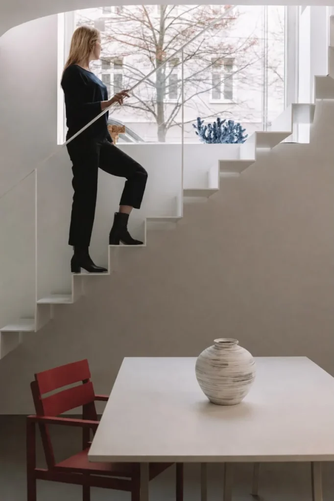
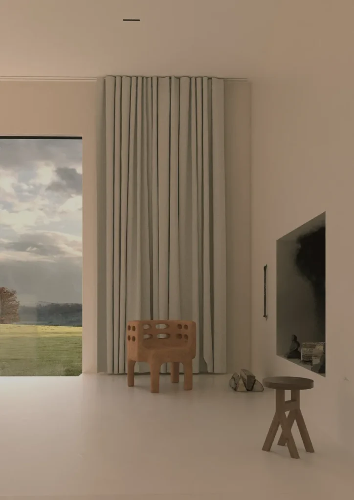
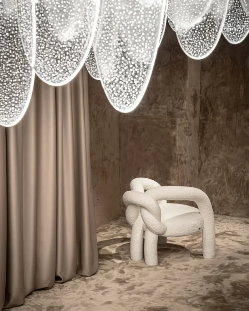
Cloud Dancer adapts easily to the different rooms in the house. In the living room, it can emerge from an armchair, like the Why Knot, which adds comfort and elegance without dominating the space.
If you prefer a more discreet change, textiles are an excellent option. The cushion Influencer, for example, introduce this warm white subtly, whether on a sofa, a bed or in a reading nook.
Instead of concentrating all your decorative items in the same area, it's worth distributing them around the house. This balance creates a sense of continuity between spaces and makes the decor more harmonious.
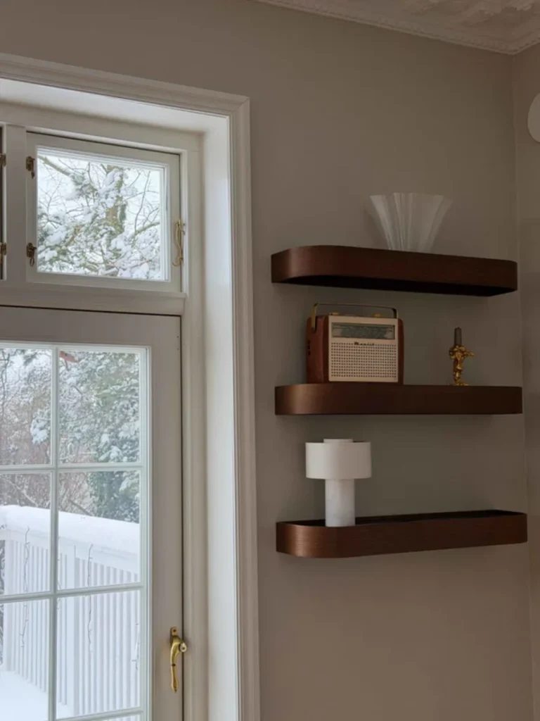
One of Cloud Dancer's greatest qualities is how it enhances its surroundings. Wood, natural stone, ceramics, linen, or natural fibres gain greater presence when combined with this shade, creating balanced and welcoming environments.
Furthermore, light tones help to reflect natural light, contributing to a greater feeling of spaciousness, especially in smaller rooms.
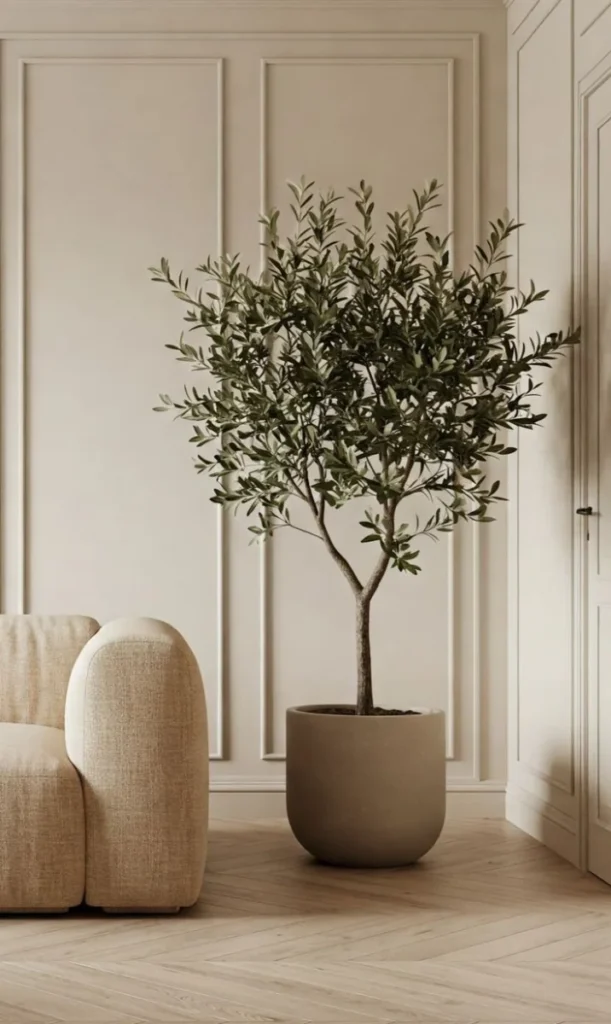
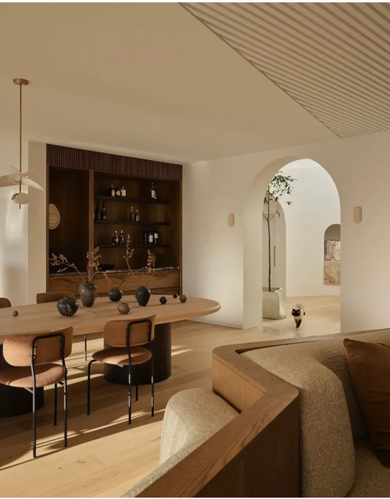
As with any trend, the key is moderation. A completely white space can become monotonous if there is no contrast.
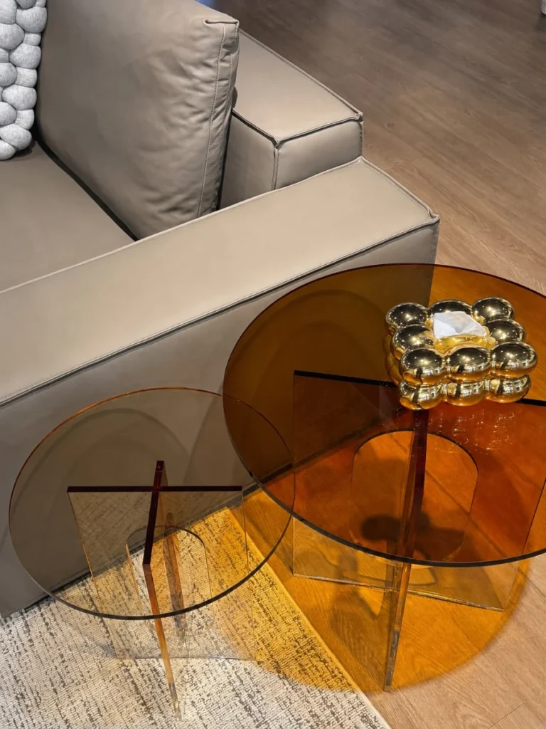
Natural woods, earthy tones, caramel details or black accents create depth and help to compose more interesting environments. The set of side tables Gisele It is a good example of this combination: the contrast between the transparent acrylic and the caramel finish adds warmth and lightness without overpowering the decor.
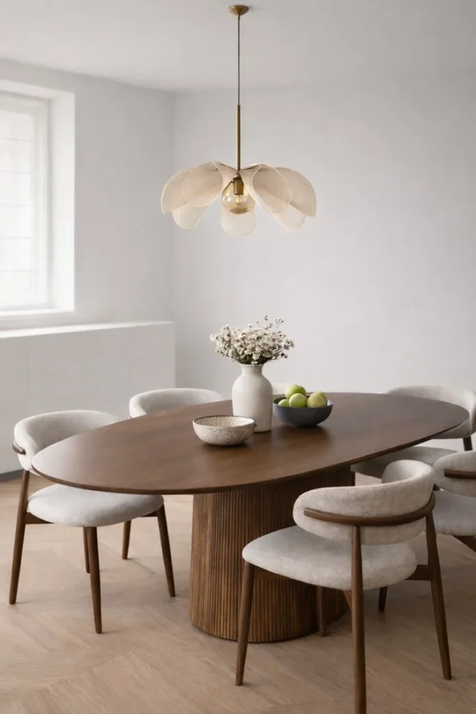
Trends exist to inspire new ideas, not to define rules. Cloud Dancer stands out precisely for the ease with which it integrates into different styles and for its ability to keep pace with the evolution of a space over time.
Whether through a piece of furniture, new textiles, or small decorative details, this warm white allows for a simple interior refresh, maintaining an elegant and timeless result.